Tuesday, 26 March 2013

Anatomy: Skeleton


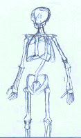
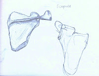
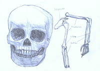
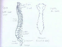
The purpose of this task was to study the anatomy of the skeleton, to gain an understanding of the overall structure, as well as how each main bone moves and what it's purpose was, as well as learning the correct shape for each bone.

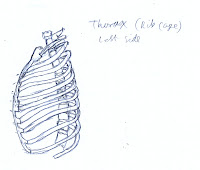
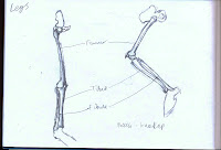
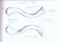
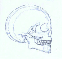
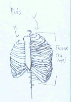
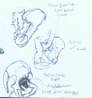
I started in my sketchbook. I looked up different bones from a list and drew them, which not only gave me an idea of where on the skeleton the bones were, but helped me to learn the correct shape of the bone, I found some bones, such as the scapula, had parts to them I did not know about. I feel these sketches went well, they are not all completely accurate but give a good idea, some, such as the Thorax, I had to re-draw because if it's difficult shape.


The final stage for the task was to create a reference image. I used what I had already learned and a few full skeleton images to draw these. I learned some new things about where and how bones linked together. Everything on here is usefully labelled, I decided to put a guide to what each different type of joint was for reference as well. I was surprised at how many different joint type there were.


Tuesday, 19 March 2013

Personal Speedpaints


1 hour:

A digital version of a scene I have sketched before, duplicating the rockets took the longest time. Doing this did help me speed up my work flow, it displayed that I do need more practice with making quick decisions about colours and values. 


20 minutes:

This scene was inspired by a series called Eureka Seven, then I added what I wanted into it. The styles came across well however the overall scene looks a bit dark.


Week 16 Sketches


For my observation I drew a figure of Super Sonic. The shape and tone went well, however the hands and feet were a bit small.


For my creative I didn't really plan what I was drawing, I just drew what came into my head as I was moving along. I ended up drawing and slightly mad looking robot with fire suggested in the background. I feel I could have made the perspective better on this, however I like the design and feel that with a little improvement I could have a nice, simple and crazy robot.


Week 15 Sketches

For my creative this week I drew some boxes in perspective to map out a spaceship, I want to take this further and add some design and draw the spaceship properly, with some other sketches to help.


My observational is of three dragons, I think I could have made this better due to the value on each dragon being different, but in my sketch coming across as the same.


Tuesday, 5 March 2013

Dwarf, Human, Elf


This week our task was to draw a Dwarf, Elf and Human with specific proportions. The Dwarf would be 5 heads and around 5 ft, however I made him 4, the Human 8 heads and 6 ft, and the Elf 9 heads and 6.6 ft.

I used references throughout for the Elf and Dwarf, and occasionally for the human. I also grabbed a skin colour pallet. I used the reference for proportions, I also used them for foot and hand shape, colour and to get an idea of how the armour/clothing for these creatures is usually designed.


My base sketches I drew as what would lay underneath the clothes. I worked out the proportions here, such as leg length, hand size and others. For the Dwarf the legs where difficult, as they are usually presented short but quite far apart. The Dwarf did initially have a point where his legs ended, however it was erased, to measure the number of heads I mostly used the Photoshop grid, apart from with the Elf. It was quite difficult drawing the right poses with the different proportions, it would have been better to get a more natural form for each of the characters.


After importing my sketches into Photoshop or creating more layers I worked them up until I had characters with form and armour, using my references to help. I added the details in here before moving on to the values, lighting and colour. The most obvious thing the didn't go well here is the feet on the human, which look slanted to one another.
On the painting I started by adding the skin colour, from there I added the value in Grey-scale of each piece of clothing, I then added to colour to the clothing, after that I used an overlay layer with both black and white to create cell-shaded lighting and shadow. After this I created another normal layer in order to add extra pieces if lighting, blend the shadows and edit the colour where I wanted to. The lighting on the characters is fairly basic but makes them readable, one thing I need to improve on is giving a metallic look to the armour.


Week 14 Sketches


 My creative this week is a humonoid mouse in a trench coat smoking. I feel this went well, the perspective was good, however the lighting and detail was basic.
I draw headphones for my observational, I drew where the highlight would be and added the cast shadow. I think some of the size and perspective could have been better here, I could have worked in a bit more detail into the line drawing.


Week 13 Sketches


This week I first sketched a very quick idea for a scene, this was very rough, hopefully for a future speed paint.


A hitchhicker with a sign on his head. I messed around with the proportions on this one with big hands, feet and arms and a short height. I think the hands could have been better on this one, and the right elbow.


For my observation I drew a toy airplane, I drew where the lightest parts were and added a cast shadow.