Wednesday 14 May 2014

Final few days


I have placed a build of once of my project builds on my submission disk. The reason for this is that during the final few days there was quite a rush to get all the arts assets into the scene, as well as animations, and because of this some elements of the game play suffered, so I though it would be good to supply a copy of the game with the game play how it was originally designed.

During these last few days I had a few jobs, one was to code the GUI. I had to quickly learn how to code GUI and implement it, which wasn't difficult, but just took some tweaking.

(Screens)

I also built a health packs for the scene, as well as the cave asset for crouching, which were previously blocks. Where the webs where just purple block that disappeared, I made the first iteration of a web texture and added a fade out, so that it burns away with fire.

(Screens)

These implementations did not cause problems, however some of them did. There was a tree asset that replaced the blocks to get to the fire mask, however unfortunately it didn't follow the same layout and was too difficult to climb, almost the Dark Souls or trees. This was the first thing that affected the game play.

(Screen)

Once we put the character in with animations it took some tweaking to get it working, some of which was a simple code tweak (such as stopping crouching from making you fall through the floor), and other parts where a few changes in the scene, adding tags to new objects or reassigning scripts. I also coded in texture changes for the mask the character wears for when you switch masks.

The last week


Early on in the last few weeks I was working on some of the visual side of the game.

A first step was to add particle effect to any collectibles within the game, this was to draw the players eye to them and make sure that they were recognised as collectibles.

I also made a few assets, such as the medallion and the orbs, which were later replaced again, this was part of the final visual progression leading up the the last build of the game.

Aside from these things I also had to finish off some coding, the code for the project was in constant progression, even though the main game play elements had been finished.

Final few days:

I have placed a build of once of my project builds on my submission disk. The reason for this is that during the final few days there was quite a rush to get all the arts assets into the scene, as well as animations, and because of this some elements of the game play suffered, so I though it would be good to supply a copy of the game with the game play how it was originally designed.

During these last few days I had a few jobs, one was to code the GUI. I had to quickly learn how to code GUI and implement it, which wasn't difficult, but just took some tweaking.

I also built a health packs for the scene, as well as the cave asset for crouching, which were previously blocks. Where the webs where just purple block that disappeared, I made the first iteration of a web texture and added a fade out, so that it burns away with fire.

These implementations did not cause problems, however some of them did. There was a tree asset that replaced the blocks to get to the fire mask, however unfortunately it didn't follow the same layout and was too difficult to climb, almost the Dark Souls or trees. This was the first thing that affected the game play.


Once we put the character in with animations it took some tweaking to get it working, some of which was a simple code tweak (such as stopping crouching from making you fall through the floor), and other parts where a few changes in the scene, adding tags to new objects or reassigning scripts. I also coded in texture changes for the mask the character wears for when you switch masks.

Designing The Game


After the initial sketches, the main game design started once I received the finished terrain design from Max, and I had finished tweaking the character jump height, distance and crouch.

For creating the different jumping and platforming areas I created a block with the height on the standard jump and got a good idea of the distance, this helped me to block out anything I needed to. The main areas were an area of pillars near the beginning, a big tower to climb up, and any other platforms that you needed to use to make it to the end of the level.

Unfortuanately I did not have time to supply any screen shots of these, however you can see them in the game and the build that I have supplied.

To guide the character through the level we discussed using lights to draw the player's eye. However before this was implemented I used the collectible to a similar effect. We wanted to give the player a reason to explore the open world, so I placed in the scene 10 medallions (later 12) for them to collect, which they would need to win the game, this also ensure they experience most of the the game has to offer. I also added 100 orbs as a bonus collectible, if the player collects all of these the message at the end changes, saying that they have completed the game, but also gives you a super jump and access to a secret area, for a bit of extra fun.

After receiving feedback from various tutors and people within the industry, it gave more ideas as to how to implement the power up masks into the game play. One things we did, especially with the wind mask, was to make short cuts accessible so you can get around the level quicker. This played in to the fact that once the player has a certain power up they can go back to areas they have already visited to and access new parts of the map to get any collectible they still need. We used the fire mask web burning mechanic to hide medallion behind web, and where you get the fire mask, there is an area you need to return to with cloud platforms, leading to another medallion, which you need the wind mask to reach.

Later on I realised that, aside from the crouch jump, I hadn't implemented the crouch into any of the game play, so I had a think about where that could be put. I placed the mechanic in a few areas which required you to crouch to progress, I also included a new area with a medallion, and to get to the medallion it required you to jump and crouch in the air to fit through a gap.

The secret area I mentioned was a place high up where you can land on an invisible collider to get to a box that you can see floating off of the main terrain.

I feel like overall I did not did a bad job at designing the game, but more importantly I learnt a lot. About making the game replay-able, getting the player to backtrack and rediscover things, and to make platforming areas not too difficult, but still fun and a challenge. It was a good thinking about how to use the masks and where to put them, and how simply putting them in different places can make the design fall short (there was time where instead of jumping across some platform, you could just walk across the lava with the fire mask to reach the other side).

It was the technical stuff, like placing the platforms in very specific places that I really got into. During the last few days of the project if I saw someone replacing any of the platforms or moving that I would be weary that they would put them very slightly in the wrong place and then it would ruin the challenge slightly, however as this was quite last minute it was unavoidable, and luckily I felt that overall level design was still fun, even if a few jumps are a bit easier.

Coding The Game


Of course to get a game playing and working it takes coding, and i've done quite a bit. I'll put a list of everything I can recall and unfortunately I don't have time to go into much depth, but the list should be quite self explanatory, especially after playing the game. The scripts are also supplied on the disc and further below.
  • Camera - Follow, tweak and reset
  • Controller With Joe
  • Jump, Double Jump, Crouch and Sprint
  • Melee Attack
  • Fire Projectile attack (later only with fire mask)
  • Enemy Damage and Health
  • Enemies approaching player within a certain distance
  • Death & Respawn
  • Player Damage and Health
  • Pause screen with reset game option and controls GUI
  • Collectible -Orbs which move towards the player within a certain range
                     -Medallions
  • Fire Mask -Powerful Charge Projectile
                     -Stand on charcoal which would usually kill you
                     -Web burning with projectile
  • Puzzle -Shoot objects with the fire projectile to spawn a medallion
  • Wind Mask -Stand on wind platforms
                       -Hover after double jump
                       -Powerful charge melee attack
                       -Crouch jump, to reach higher platforms
  • GUI -Originally text but adapted with images
            -Doll that falls apart for health
            -Medallion Image and Count
            -Orb Image and Count
            -Charge Attack Guide
            -Y button on help tutorial masks
  • Help Tutorial Masks -Masks where if you get close and press Y will give you a message
                                    -Small prompt to tell you to press Y for the message
  • Super Jump and Secret Area -Once you have all the orbs you can do a super high jump
                                                 -This allows you to get to a secret area within the scene
  • End Gate -Tells you to collect more medallions if you don't have them all
                   -If you have all the medallions it will fade to black, tell you that you win, urge you to get the                    rest of the orbs and carries on.
                   -If you have everything it fades to black and tells you that you have finished the game, and                    then carries on.
Here is a link to these scripts, you can also find them on the submission disc:

(Link)

Joe gave me some help with the character motor, without him you would get stuck on a steep surface and not be able to move, forcing you to respawn. Joe used complex code to create a sliding mechanic, which stops the character from jumping on steep surfaces, but instead will slide down them, this was a huge help and something I could not have done with the knowledge I had at the time, or it would have taken me away from coding the game play I wanted to focus on.

Joe also coded some more of the character motor, the gravity would usually make you fall at a constant speed, however he created acceleration, so as you fall you keep falling faster, until you reach a terminal velocity. Together we coded in air movement, as before you would not be able to move the character as he was jumping, this was a very simple piece of copy and paste which I thought would be more complicated, but he pointed out the simple solution.

Here is a link to Joe's blog post about the character Motor:
(Joe Link)

I feel I did well at coding overall, I did more that I expected I would and probably as much as I hoped, I think if I spent more time on it I obviously could have done more, but I spent a lot of time on this and got a good result because of it. I learnt quite a lot, but was mostly using what I had already leaned and combining things to get different results, I think not learning as much variety as I could have was one of my downfalls.

I really enjoyed coding all of this, and i'm glad it's an area I chose to approach for the project.

Sunday 11 May 2014

Getting the terrain


I mentioned earlier that Ed and I drew up a top down sketch of the level, which you can see again below.

Of course we needed this in 3D space, so I worked out how high each of the levels on the map were going to be and got to work.


I started out boxing it in with planes in Unity. This was a mistake, it looked very blocky and man made. The scale and measurements were correct though, so I used this to further put the grey box together.

Ewan told me to use Maya and quickly gave me a run down of how I can quickly block the level out in it and have it look natural. I then created in in Maya, although it took a while it was a lot quicker than creating it in unity, not only that but it looked better and was easy to edit. We scaled some areas up even further from what we originally planned.

Unfortunately I did not have to time find my file of the terrain and post a screenshot.

From there we needed a terrain, which Max made a very quick start on. the first few iterations of this were not what we were looking for. However he listened to what I said and gave me a terrain one day which was perfect, it did exactly what we wanted and allowed us to have all the areas that we initially planned for. 

I then took this terrain and started designing around it and using it as a basis for creating game play.

Coding - Camera and Controller


Obviously for a third person platformer you need a controller and a camera that does what you need it to do. To start with we wanted the controller to walk around and jump in a way in which you could edit the distances it could jump and make the controls feel smooth. for the camera you want to be able to rotate it yourself, but also for it to follow the character in a natural way.

This was not easy, not at all. I debated with myself whether to take what was already in Unity on code some of my own things. I decided that I did not want to take what was default with unity, partly because I just didn't like it.

For both the controller and the camera, I tried many different things, my own code, code online and more, however there were always bugs, or code that interfered with each other. at that point I did not understand why. I ended up with commented out code all over my scripts, keeping in what worked and trying new things. One time I scrapped and restarted the controller completely.

Early Scripts on Disk

I then realized that I really needed to get a grasp on what some of the code I was copying was and what it did, so I went through the basic scripting tutorials on the unity website, and from that I became equipped with what I needed to know.

I decided to take what I liked from the scripts that are provided with unity, and then code changes to them myself. I did this with the main camera, and achieved a very nice result from it. It took a while but was worth it.

For the character controller I took the default ground movement script, and then looked at other code people have created for jumping, and used one of them to create my own jumping script.

Ealry Scene on disc

The result was a character controller with a few bugs, but much better than before, and a camera script which followed the character smoothly and well, which the player could also influence. I was also left with one document full of commented out script that I decided to keep for reference.

Final Scripts on disc.

When I got to this point I realized that I had leaned a lot, and had a result that was by far better than Unity's default. It was at this point I got a bit confidence boost and realized that I could code a lot for this game.

An Otter Tale is born!


One day, after thinking of many different ideas, things seemed to come together in the blink of an eye. Ed and Max suggested a Voodoo/Hoodoo theme, we then decided on open world game play, and that the main character should be an Otter.

From there we thought of many different ideas, such as using Masks as power ups and thinking about how it worked. Some ideas got scrapped, such as throwing a Voodoo doll of yourself and being taken along with it. 

There was also the intention to have some much more complex puzzle section where you would really use the different masks to influence the environment, but this was something we didn't have time for.

Ed and I drew out a concept for the level, just an overhead view of how it would all work. We then discussed further ideas, did sketches and worked through things, my sketches and the overhead level sketch we did you can see below.


Once we had all the game play figured out, it was time to organize coding it into sections, I remember initially looking at the list and thinking that it was way too ambitious, but we sorted everything into priority order and iterations. This was definitely the best choice as it would make sure we had something payable, which we could then build on. You can see the three phases below.


Early Ideas and Sketches


Early on we decided on a 3D platformer, we were all happy with this as it was quite an accessible style of game to artists, coders and game designers.

Of course deciding that does not specify much, we thought about many different game play mechanics, game pace, whether to have it open world, character abilities, the theme of the game, story and much more.

A concept idea of my own was to have a puzzle platformer, where you explore a game designer's mind trying to save them from a creative block, as you went through and unlocked more it would get crazy, there would be more to do and things would start to flow together.

An idea that max came up with was to use different gears when playing as a little robot character, to shift between speed and power. I thought about this idea and drew up some sketches and ideas for it over a few evening.


The vertical slice


Not too far in to January we had formed teams for the vertical slice. I was with Max, Ed, Ben and Joe, then later Nik joined us. The first part of our job, aside from handing out roles was to decide on an idea for our game, both game play and concept/theme.

I quite quickly too the job of Game Designer and Coder. The rest of the jobs got divided out, but that was the easy part. for the game idea we went through many different ideas, the only thing we settled on quickly was to do a platformer, which we later decided should be 3D.

Of course deciding that does not specify much, we thought about many different game play mechanics, game pace, whether to have it open world, character abilities, the theme of the game, story and much more.
Then everything started to come together, Ed and Max suggested a Voodoo/Hoodoo theme, we eventually decided on the character and the game play mechanics we wanted to have. This was a lot of fun, even though there were a few disagreements between us.

We then looked at our different tasks and what we would have to do, I looked at how ambitious we were being with the game and decided we should split the code into iterations and levels. Still, it looked like there was a lot to do.

My job I knew I was going to enjoy, and I have. Taking on game design I was confident with, but coding I wasn't exactly a master at so I knew I would have a lot to learn from then on, especially to code most of a game. I knew Joe was going to help me but I needed independent knowledge as well. My job was big and early on I wasn't sure how much I would be able to do.

A fun thing about this project is that at no point I was able to say "Yep, that's done", I was always going back to things, tweaking and changing them. Unfortunately there is no way I am going to have the time to blog about every little detail of what I did and get the game completely visually finished off in the last few days, so I will just need to find the right balance.

Character Avatar & Other Work


Linked the the refectory project, we then had to create a humanoid character avatar. I chose to make myself.

We need to create a Diffuse and Normal map, as well as have the character rigged for animation.

This involved creating a Diffuse texture in photoshop, from reference images of myself. Building the low polygon avatar also using myself as reference, sculpting the high poly avatar in Mudbox, and rigging the Character in Maya for animation and testing the rig in unity.

Here is the low polygon version of the model, I put in some close up shots of the face to see the topology. It took me a while to get to this point. Later on I added in eyes as a separate mesh.


After creating the low polygon model (actually quite a bit later in the project) I created the diffuse texture. This was difficult, and after a while I got a result, how I don't think it looked too good, and I should have spent some more time on it, especially the face.


This diffuse includes the AO map, which made some parts of the face look a little strange.


I also created this texture on the eye from an online image to get a quick result.


Here is the AO map standalone.


Tanguy helped me get the folds of the t-shirt right in the sculpt, he encouraged me to do a sketch first which really helped.


After I spent a while tweaking it and working towards it I got a result I liked, it isn't perfect but I feel it works well, there is some nice sharp detail and the mesh does look interesting, even if some parts of the sculpt are a bit rough.


Here is the finished normal map, there was a bit of cleaning up I needed to do in photoshop, though not too much.


Another part of the project was rigging. I spent most time on this setting up the bones. After those were set up I simply added a heat map and slightly tweaked the vertex weights, the rig was rough but it was functional. At this point of the project we were running out of time so I took the quick route.


Unfortunately I lost my copy of the Unity rig file, so I couldn't upload a screen shot of it, the folder seemed to be empty in all backups, so something must have gone wrong. The rig was decent however with big movements, like moving the arms above or below 45 degrees, there was some clipping and strange deforming.

The final render I was happy with, I could have done a lot better but for a first character I feel it went well, especially with how quickly I did a few of he steps because of time.

I think better time management on this project, leaving room to iron out some bugs in the maps and work on the diffuse some more would have made the final result a lot nicer.


Aside from our main projects, we also had a few lessons with Robin where we learned other things.

We learnt the basics of Zbrush, how to get around some of the interface, however I unfortunately do not have any screens of this.

We were also at one time on the way to practicing dDo and nDo, however we didn't make it in the end, I think we decided that it was a complex way to start, so went went through nDo and how it works and left it there. I learned a few Maya tools in unwrapping that have been useful since, it was just a tick box, but sometimes that is just what you need.

We were given a plane with no UVs.


I got to the point where I had most of the plane unwrapped, and all texture space was even.


 The "Keep Image Width/Height Ratio" check box was very useful as it avoided having to scale any UVs whenever they were created.


I created this in nDo for some practice when we were going through the basics. Overall I found the programs quite easy to use.


One cool things we did was learn to use the Maya 2014 quad draw feature. We seemed to get to grips with it quite quickly as it was a very easy feature to use, however I also discovered some places where it can get confused and struggle, this gave me a further idea of how to treat topology as I am using it and with models in general.

(WIP screen?)


Saturday 10 May 2014

Refectory Project - Game Design


Now for my favourite part, the game and environment design. Being the lead designer I came up with the majority of ideas in the design document, however also very much enjoyed working with other people to design and flesh out some of the ideas, this was perhaps my favourite part because I learned from them in the process.

Here are a few of sketches and notes that I made throughout the design process. I did not scan all of these in as a lot of it can be seen in the design document.


Below is a design document of all the different ideas and environment designs that we came up with, I will list other people's name wherever I remember being helped.

The main idea of our version of the refectory was to create an environment that people knew, they would be able to do all the things they usually would there, such as play pool, but to then go beyond that and put things in through environment interactions and mini games that they would not usually be able to do, such as through things around the room, play hide and seek, or play basket ball with the recycle bins.

Here is a link to a PDF of the game design document, also found on the submission disc.
https://googledrive.com/host/0Bzo0UfEzLxYedjVDcnpNbkNxSVE/GameInteractions.pdf

Overall I did surprise myself with the amount that got designed ready for the game, and how it would all fit together. It was just a shame that, just as with the sounds, most of it did not end up in the final build. The main difference between this and the sounds is that I feel like this was very worth while practice, I developed skills, learned from others and pushed myself into thinking of many different ideas and thinking of how it would all make the player feel. When I later created the design document from all my notes and sketches, Martin outlined what kind of things I should think about and include, which helped me think even further.

One thing to learn from is what would have been difficult and easy to do, a lot ideas here are ambitious, especially the mini games. A few would have been quite easy to do, and some of the interactions would not mostly likely not have been difficult at all, however as we ran out of time most of these were left out.

Refectory Project - Sound & Code


This was a completely new area for me, I have never done sound design for anything before and I can't completely remember how I got round to doing it. I think we just decided that some sound would bring the whole thing to life.

I enjoyed doing the sound, and was apparently very good at it, however it is not something I want to specialize in, nor can I picture myself doing it for any extended period of time, however the fact is I designed some sounds.

I went about this by first considering what sounds we needed, most of which I got and did not have to go back and obtain later on.

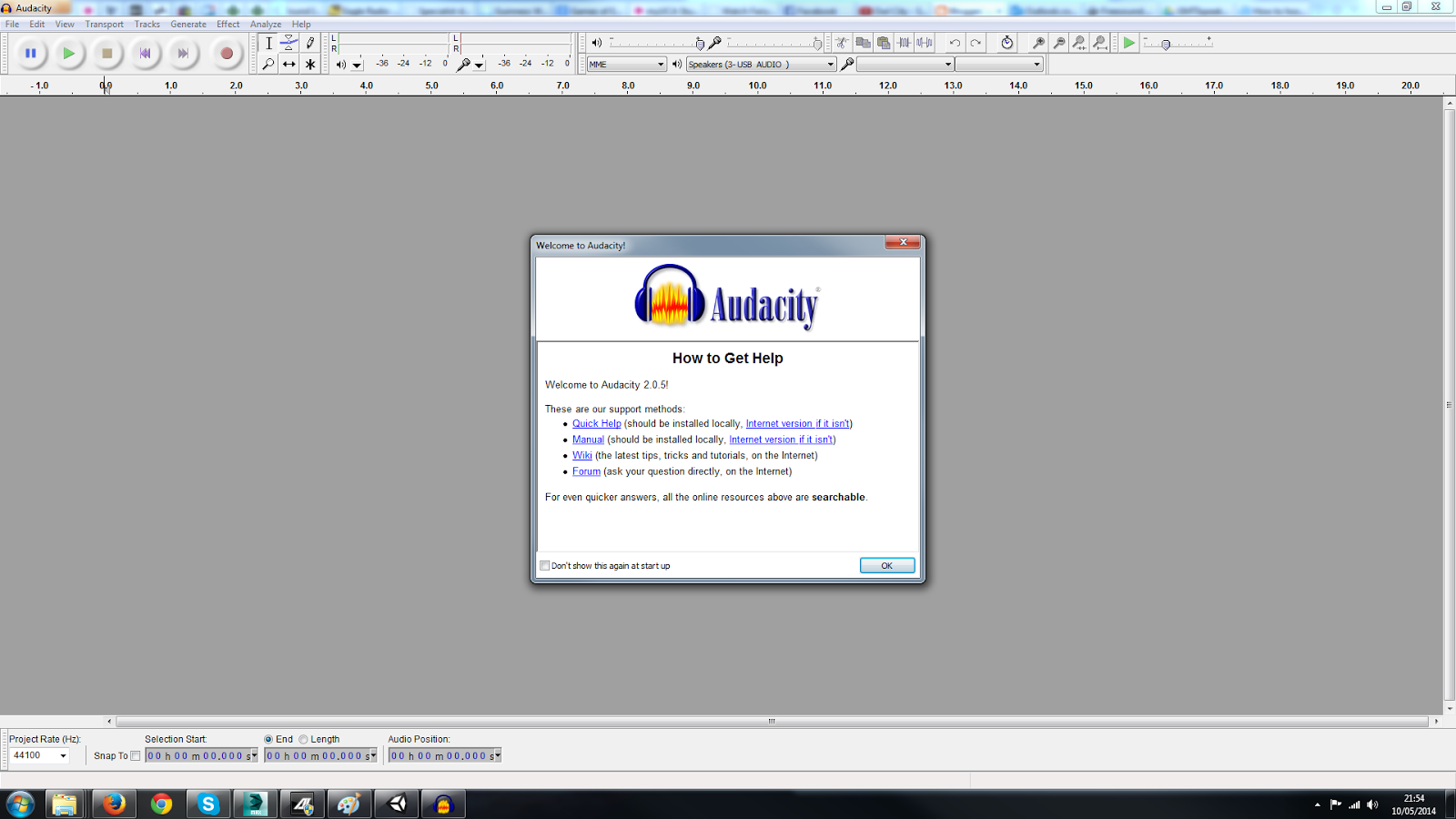
I made a list of any sounds we needed and decided that whatever sounds I was gathering, I both should and would need to edit them. For this task I downloaded Audacity, which conveniently had a portable version which I could load directly from my hard drive.

(sound list?)

To gather any initial sounds I needed I started with the internet, which after searching round I discovered that http://www.freesound.org/ was the best resource. Barely anything on there you can use in its raw form, however after editing and combining sounds you can reach the result you are looking for.

http://www.freesound.org/
 
 
Please see sounds on submission disc

As good as this website was, there was a limit to what I could obtain, so some of the sounds I needed to record myself. I used a Roland Recorder which I borrowed from the university stored to get any sounds I needed. The most fun I had with this was recording my own "effort sounds" for the character.

Please see sounds on submission disc

Next came the most time consuming part of the task, which was editing and producing the sounds. I did all sorts of things, such as chopping sounds up, layering them, changing the speed, pitch, adding effects, editing the volume and more.


Some sounds were very easy to create, it could be a case of cutting and layering a few sounds to obtain just what you are looking for. However other sounds were a huge pain, it took a long time to get them right, which sometimes involved very small tweaks, or creating something to scrap it and start something new. This really tested my patience but I eventually managed to get a result where I needed to, there did have to some times where even though a sound wasn't exactly what we wanted I had to call quits on it and move on.


The final pool of sounds I am very happy with, some could have been better but I feel like I tackled the time quite well. The skills I learned haven't completely gone to waste as I used them when designing sounds for Flood Rush, though on a personal level there isn't too much of a benefit to me, which I feel was the biggest down fall of tackling this area.


I also feel it is a shame that a lot of the sounds were left out of the final build, there unfortunately wasn't time to put them all in and code triggers for them, but I still have all the sounds, and it is clear to here what they were intended for.

I worked on part of the process of putting the sounds in to the scene.

I created a unity scene with speakers rigged up to music in order to test and demonstrate 3D sound, I also tried to play a sound when pushing a box, however I think I was told not to worry, so did not finish coding it.
https://googledrive.com/host/0Bzo0UfEzLxYea0F3V2VlbnNhWWs/TieIn.html The build is also on the submission disk.

I also coded the walking and running footsteps, and the jump and land effort sounds to work with the character controller. I had some help from Ricardo making sure the right sound played when landing, depending on if you were pressing the sprint button. I found this quite challenging and very rewarding. It was interesting because Ricardo introduced me to a logic system which I then needed to get my head round and use it how I needed.

https://googledrive.com/host/0Bzo0UfEzLxYedmRZSHhZRnFTbWs/Coding.html
The build is also on the submission disk

Refectory Project - Asset Creation


For the project I made quite a few assets, roughly 14. A few of them were very easy and were literally a cube with the correct measurements, others actually needed to be modeled. 

The majority of these I modeled to the correct measurements and then passed on to be textured, however with the exception of the Recycle/Food bin which Ricardo did some finishing touches with (however from what I remember the screenshot here is before I handed it to him), the other exception is one of the plugs, which I textured myself.

Z1 - Bin Side Attachment


 Z1 - Kenco Coffee Machine


Z1 - Vending Machine, used for both food and drink machines


Z1 - Water Machine


Z2 - Food & Recycling Bin (Which Ricardo later took to tweak)


Z2 - Rubbish/Recycling Bin Closed


Z2 - Rubbish/Recycling Bin Open


Z3 - White Pool Ball


Z3 - Pool Chalk


Z3 - Pool Cue


 Z4 - DJ Desk


 Z4 - On Stage Speakers


Z4  - Microphone Stand


Z4 - Hanging Speakers


Z4 - Stage Walls & Sound Desk


Z4 - Stage


Z4 - Stage Steps


 Z1 - Corner Plug

These plug I textured myself, this was more challenging the I expected because the images needed a lot of editing in Photoshop, however it was not too difficult.


 I feel overall these went quite well, for the time I spent on them and considering they needed to be low poly. The topology was mostly fine, apart from the bin the Ricardo tweaked. 

I feel it was a good idea to pass these on to other people to texture, as there are people who are both better and fast than I am.

Overall building these was not too difficult of a task, I just needed to make sure they were the correct size for the scene and followed an accurate shape to the real object, without creating bad topology. After adapting to 3DSMax again I enjoyed this, I did not feel it was a big challenge, but still good practice and it was good having a work flow with other people.