Showing posts with label 2D Visual Design. Show all posts

Thursday, 30 January 2014

Tree With Character


This task was to create a concept for a tree that had character to it.

I started by looking at references of tress standing by themselves. I wanted to have a feeling of it being isolated, but also a tree that a lot of people would perhaps notice and sit under or climb, to look at the landscape surrounding it. Of course a tree being by itself doesn't rule out to possibility of it having birds sitting on it and different animals interacting with it.


I then started to go down a route with my references of tree that had been influenced by man. This is part of the interaction a lonely tree will have throughout it's life. I like the idea of the tree being used to create something, rather than replaced.


I looked more at tree houses, a mix where man has used nature to create somewhere to live. I also liked some ideas, such as dangerous swings hanging over a cliff and small post boxes and lamps being used to light itself up.

I made a few sketches of trees for practice, and then sketched out a final design.


I started by sketching the tree and then added all the little man-made parts that turned it into a tree house, thinking about how they would fit. Some proportions may have been a little off, but the main concept was put across.

I started adding some colour and shading.


However after talking to a tutor I decided to do all of the tone first, and then move on to colour afterwards. I added lights to the scene, making the main parts of the tree glow in a dark scene.


I also added a back ground to give an idea of where the tree was, overlooking a cliff.


Finally I added colour, which brought the picture out a lot, added a texture to the tree, and added in a small figure, partly for scale.


The final image I was quite happy with, and I like the idea. Though it does have it's problems. It could have been painted better and the background cuts in the foreground a little too much.

There also needed to be more focus on the tree, giving it roots for support and so more shape. As it is it focuses a lot on the man-made side and not on the tree, which does not fir the brief.

The painting could have been more three dimensional, but I like the result, I feel it is clear in what it is trying to get across if it were to be put into a game.

Wednesday, 27 November 2013

Christmas Card


This week my instant thought was to do dragons, and make some pun involving warmth or forged. I though of many different ideas, brain stormed, drew, made thumbnails and sketches, simplified my idea and composition multiple times which resulted in spending too much time of that, and not enough on the painting.

Reference Images/Mood Board.


Sketches/Painting assets into a scene.


For my idea I was going to involve two baby dragons, so I wanted it to look cartoony and cute, so I decided to go for cell shading, which also forced to work on my colours as they'd be carry a lot of how the card looks.


After having some help from my classmate where we talked about the colours, I decided to rethink them and make it so they are less bright and have less of a clash.


I also decided to make a version with the line art from thew original sketch still showing, and one with the original sketch only showing on the dragons.


I did one with some brighter colours.

Then I made one almost greyscale.

In the end I didn't really like the final painting, however I liked the idea and the sketched I did for it.
I think the colours and painting could have been a lot better, especially if I had organised my time to spent less time sketching and more time painting.

Thursday, 14 November 2013

Surreal


A surreal painting was one I thought would be really fun to do. some of my artwork can be quite strange already, however this gave me the opportunity to mess around with a few known conventions.

I started thinking of some my favorite pieces of surreal artwork that I used to look at a while back. then I started thinking of something that popped into my mind once whilst I was trying to get to sleep. So I ended up with the idea of a giant egg with the yolk becoming a reflection (from Dali's painting) and three white and pink rams playing the violin whilst doing the Kan Kan (from my head).

I had gathered images of art work from Salvador Dali, Geogia O'Keffe and different references for what I was going to draw.

Then from some music I listen to came the idea of something swimming in smoke from a burning bridge (Linkin Park - Burning in he skies), so I decided to turn this into something more literal.


Mood Board, containing sketches and images of what inspired me.

I ended up working through a few compositions, some of them where too chaotic (going for a level design feel) as there were too many surreal ideas thrown all over the place.


I decided to temporarily remove a few of the surreal ideas and focus more on composition. I soon ended up with a nice composition, which then allowed me to bring some of the ideas back in without it feeling too cluttered.


I then started to sketch and design different aspects of the painting (in mood board), so when I get to adding them in later on they can look accurate and won't be a pain to draw.

I also created the egg in Maya to put the lighting I wanted on it, using a white blinn material and an ambient light, I could then use this to have the lighting in the exact right place in the painting.

My final painting was pretty crazy, I put in quite a few surreal ideas, some subtle and some more noticeable. However there are things about it that don't quite look right which you might not notice right away. I played with lighting, I also added three main circles and played with the idea of what a circle can represent (one of them represent 3 things). 

I also played with lighting on the egg, it is being lit up from the same source, but further into the foreground. I had a burning bridge with smoke, the things swimming/flying around the smoke are based on kites of sting rays. 

A few happy accident came my way. One was the ram near the yolk looking like it was emerging out of the yolk, however the original intention was that it is climbing out of a hole. The tree of the right I did in a white line, I thought this looked really nice, so I added a few darker lines and left it almost transparent, adding some clouds in behind it to add to this effect.


I think I could have done better in the actual painting of this. It took me a while but it still could have been taken further. The ram climbing from the yolk could have been drawn differently and the things flying in the sky could have been given different perspectives.

I found that my painting contained a collection of designs, and different parts of the painting could have been their own surreal painting. Where as this isn't necessarily a bad thing, I could have saved more time and gone into detail by choosing one idea and focusing in on it.

Thursday, 3 October 2013

Underwater Creature

For my underwater creature, I decided to make something based on a Manta Ray, how include an axe and hammer shape, inspired by sword fish and saw fish.

I looked up reference images and made sketches from them (to be uploaded, have sketches with me), to get an idea and feel for the shape Manta Rays have.


I the sketched out my design and shape, the head I changed to something that fitted. I wanted a shape that looked steam-lined.


I then moved on to 3D and created the creature in Maya.

I started off creating the creature flat to the same shape as the concept.


I then started adding some form and volume, but being careful not to add too much because of the type of creature it is.


I then added detail to the fins, as well as some gills on the bottoms, as well as antennas on top and eyes at the front.


I curved the fins up to give it some motion and a bit more form.


I finally added some quite simple textures, just black and white.


I then tried to do a few variation in rendering, using Mental Ray and a sky dome after feedback, however I did not get very far.


For the final painting I curved the fins as though it is swimming and added black and white textures, similar to a Manta Ray.

Final Painting

 I realise now that I could have used the subdivide tool in order to get a smoother mash before the paint over, and I also could have used a shader that looks less artificial. The final design I like, it's an interesting design, almost like a Pokemon.

I think I should have also added a blue overlay, so that the creature appears to be deeper, which would suit the background.


Monday, 22 April 2013

Pixel Art Evolution


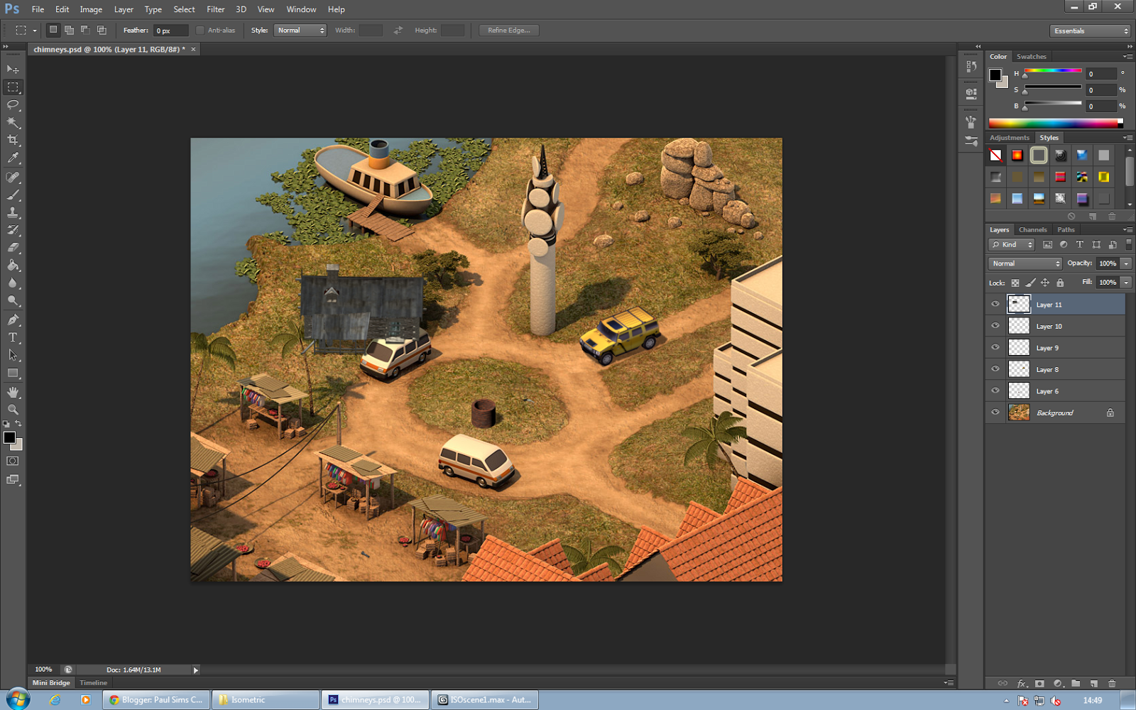
To practice representing things in the isometric view, as well as altering the lighting to fit a scene. 

We started by importing models we wanted to use and placing them into perspective, below I use a hut.

I altered the light and shadow intensity in order for it to fit with the rest of the scene. it was challenge with this particular model as its base colour is dark, so changes in lighting were less noticeable and readable.

I used a plane to create the shadow under the hut, and adjusted the lighting to make it fit the rest of the scene. This plane was altered to not appear in the render.

In Photoshop, after rendering the object out as a Targa, we placed the object into the scene with the other objects created, and they fit well. The shadow has an opacity effect, rather than just being set for one part of the image.

In the final image I added a yellow Jeep, a dark hut, a well and a torch/flash-light. I feel the overall it went well, everything, including the hut, seems to be believable within the scene. The hut and well are in a different style, which I could improve on. The hut especially is quite odd within the scene, however that was intentional.

Girl Texture map deconstruction and animation


For this task we were provided with a figure that had already been pelt mapped, so our task was to skin the character for animation and completely re-texture them. I attempted to give a proper human face or to change the hair colour, however I had trouble finding a proper reference image to use, and the hair line did not look right with a colour change.


I recoloured and re-textured areas such as the trousers and jacket.


The animation is a simple sit down animation we were provided with. I took away the pony tail as it wouldn't fit with the texturing. The skinning for the animation seemed to go well, I managed to avoid stretches or any obvious abnormalities. We used a provided test animation to help see where any abnormalities are.


Anatomy: Muscles


This task, similar to the anatomy of the skeleton, was to gain an understanding of the shape of the main muscles in the body and how they worked, as well as what their function is.

I started out by doing sketches in my sketchbook of the body's main muscles. It was interesting to see exactly what they were connected to and what they were used for. I started to think of what movement would be like without a certain muscle and how it would affect the body performing different tasks. One of the most interesting for me was the Deltoid and thinking of how it works together with the arm's Ball & Socket joint.


Using the skeleton I drew before as I base, I began to create a reference for muscles. this captures the shape and placement of all the main ones, as well as how they fit in with all the other muscles I didn't study during the task.


I think I could improve by labelling in which direction muscles expand and contract (however I did draw lines in my sketches to suggest this). The side view of the skeleton was difficult to find a stock image for, and I feel the one I used was not as accurate or detailed as I would really have liked, sometimes this stock image and the other ones I had gathered did not completely match, however the main muscles were all captured and covered.