Tuesday 22 April 2014

Realistic Crab Asset Creation


Images, Textures, Sketches and Writing to come (Everything)

Our last industry standard test of the year was to create a realistic crab. This took me a while to get to as I had quite a bit work load.

For this we had 4000 triangles, and 1024x1024 textures for diffuse, normal and specular maps.

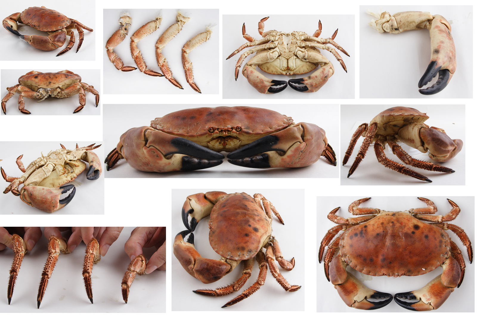
We were given a lot of reference from this, some of which you can see below.


I started in Maya, using some of the images for reference when building the crab, I started with the body, and then built the legs as separate objects, as the brief states that they need to be animated.


I then used roadkill to unwrap the individual parts for one half, and then I laid out the UVs.


After that I duplicated the other half of the crab and merged it into one, all the UVs apart from the top of the crab I mirrored.


After that I took the pieces with the largest UVs, some of which overlapped other identical parts, into Mudbox and used the many reference photos we were given to paint the crab using projections.


I then put the diffuse on the crab in Maya and exported it to Mudbox, I then used the diffuse to help guide how to sculpt detail, my main focus was the main body and the face. The diffuse needed a little cleaning up, which didn't take longer than five minutes.


I had to clean up my normal map a little, but it was a quick fix.


For the specular map I grey scaled the diffuse, inverted it, changed the brightness and luminance and painted over it.


The final image I am mostly happy with, I think there are some things I could have done better, for example there are a few seams on the diffuse. I also think the specular map could have been very slightly stronger, and the normal map could have benefited a bit from taking the diffuse and converting it with nDo.


However the model I was very happy with, I found it easy to both meet and not exceed the polygon count. I did not optimize it using triangles in favour of animation and sculpting. I also like the textures and the new methods I used to create them, making use of roadkill and Mudbox's projection tool.


I also put together a turnaround of the Crab.


http://youtu.be/zTkapUVhIlM

Treasure Chest Creation


Our industry standard test this time was to recreate a treasure chest from a concept using hand-painted textures.


Again we had a polygon limit, and needed to create a diffuse, specular and normal map, however this time had much bigger texture sizes, to really push the detail.

We had 2500 triangles to use, and each texture size was 1024x1024.

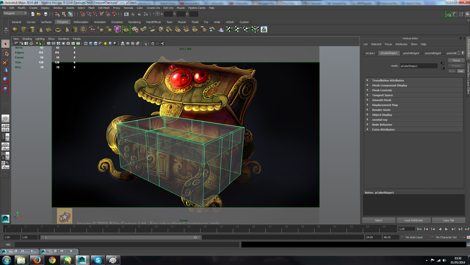
I started off in Maya, I set up a camera in a view in order to model in line with the concept art, as well as using other views of course. However the perspective in the concept art was off so I needed to improvise.


During modelling I detached and re-attached similar parts to save time, and left a few parts as separate objects as attaching them was too difficult for the result.


Once I had laid out my UVs I knew that the textures needed to look hand painted as the did in the concept art, so I used the concept art as a paint stencil in Mudbox in order to paint some of the texture on. Of course this still needed a lot of work in Photoshop, but it gave me a head start. Unfortunately I do not have a screenshot of the Mudbox method, however you can see it in the blog post for the Crab.


I used the concept art and a little painting to create the rest of the textures. This I felt worked very well for the most part.


To create the normal map I then converted the diffuse into a normal using nDo and crazy bump, then used what I thought was the best result (top images). This I feel worked well for it.


For the specular finally I used the diffuse again, but changed values depending on what materials they are on the object.


The result I am happy with, I feel it is one of my best assets so far. I managed to closely match the concept art and create decent maps with the time given and methods I used. The gems could have been better, more obviously hand painted to suit the rest rather than a single colour. I learned a lot of good methods for this to save time and make things easier, it really tested what I had leaned so far.


Cartoon Gun Assest Creation


Our second industry standard test was to create a cartoon-styled gun following a reference, with a very limited polygon count and texture size.

We had 800 Triangles, a 64x64 diffuse, a 128x128 specular and a 256x256 normal map.

We were given the drawing below as a reference, and I used the photo for an idea of how the specular and colour on a gun works.


This really put my mesh optimization skills to the test.

I started in Maya straight away, with a reference image in the background and a translucent material to keep the reference and object in sight at all times.


Once I had built the model and shaped it how I wanted, I had to optimize it in order to bring down the polygon count, and clean up a lot of topology along the way.


Once I had my model finished and my UVs laid out to make the most use of the small texture resolution, I stated creating the texture is photoshop.


For this we needed a Diffuse, Specular and Normal map.

I created a diffuse map in silver with varying tones as though light is hitting from the top, I organized the shine of my specular in the same way, and the normal I created in nDo, to add any other wanted detail that I couldn't before.


The final image of course looks better with the higher resolution textures, however the low resolution one I am happy with.


I learned a lot about where I made mistakes and how I can make it better. For example I should not have spent so long on a diffuse that will have such a small resolution, having said this I feel it worked for the cartoony look reasonably well. One of the main things that lets this down is that some hard edges need to be soft and the opposite is also true, which I may fix and post a new render.