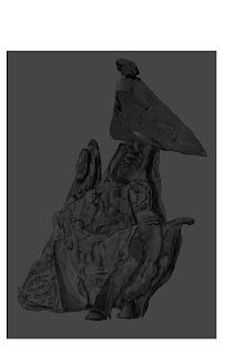
Tuesday, 26 February 2013

Rock Monster


The task to design a rock monster with a limited, subdued colour palette. I started by gathering a selection of different references images and using their variety of shapes to create 3 ideas for monsters.


Initial sketches/Monster ideas. For each of these creatures the shapes they are made up of can be found in the reference images.
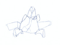


I quickly decided which one was my favourite and sketches in to a more recognisable and workable shape.


I started in Photoshop by cutting parts out of the different images to create the form for my rock monster.

I then drew over the image to create my line drawing.

From there I used the original images as reference to add in the detail, values and shadows of the rock monster.

I added a colour highlights and created a colour underlay.

I then added a colour overlay, this was initially my final image.


A part I missed out from the final design was the glow of the eye, I put this afterwards so that the viewer's attention is drawn to the eye before anything else. The glowing eye also gives it a small sign of organic or mechanical life, amongst the solid rock structure.


I feel I captured the look and feel of rock here very well, it also has good detail and the shape and design of the creature I am very fond of. However I think I could have given it more areas that define how it moves, as at the moment it doesn't have any joints, however in the design some of the joins are hidden, such as for the legs.

Lava Monster


For this task I used various techniques to create a Lava Monster. I used a few references to make sure I was getting the look of the Lava right.


I used 2 styles for the Lava so I could draw in into the scene easily, however I started with a Silhouette. after getting the lava line of the creature right I added some definition to the edges of him, to make him look like he's made out of individual rocks. I then added the environment, such as the pool of Lava he's in and the less saturated background. I made the face brighter to draw the viewer's attention.


I like the look of the creature, exited, cute and slightly scary. I feel I could have defined where the arms where more or added some light and shade to define the shapes, however I like the appearance of it almost being a blob. The lava effects I also think could be improved on with more variation.

Tuesday, 19 February 2013

Blending


This task we were given to practice blending colours and tones together.


I used a chalky brush with opacity jitter turned on for the first stage, this helped paint the selected colour sparingly. I also used the colour picker often to pick the more blended colours between the colours I was blending together to gain more control.

After the initial blending I used the blur tool to take the blended look further and to make sure the image was looking smooth and more readable.

Original


Blended


I feel this task went well, it didn't take very long and I learned some useful things from it. the image in some places still has a bit of a chalky look which I like. One thing I think I could improve on, with more time, would be making the chin, eyes, ears and jaw-line look more organic.

Debut Technique Painting


For homework this week I watched a tutorial by 'Daarken' (Debut) on the techniques he uses when painting a piece of concept work, something simple like a head. I started to do this with my own design, following the techniques he used.

The character design is based on two of my past sketches.


I worked through the dark and lights on the image and created lighting and shape for the scene. I also used Daarken's smoke and dust technique to give the image frame some form.


I then put in some basic warm colours using overlay, such as red, yellow and orange.


I still feel there is more that I can do with this painting and there are more techniques to try before I settle of a final image. I also want to give it a more defined look.

I decided quickly after a class review that the colours were too bright, so played these down a bit.
For the rest of the image I worked through the tutorial video and Photoshop file step by step using and learning the different effects and techniques. This included a glow effect, sparks, background colour, several adjustment layers and layers where the detail was updated, which forced me to keep thinking about the shape and form of my character, and updating aspects of his looks.

Final Image


I am very happy with the final image, however a few things I could improve on are the overall detail of the character and the lighting n the helmet could have had more shadow further back, as in it's current state it doesn't quite follow the lighting of the rest of the image.

Week 12 Sketches


This week for my creative I drew my imagining of King Nathan, King of Tigers from a story of my friend's.


For my observational I drew a PS2 controller, I was at a strange perspective with this one but that isn't too bad, the challenge for me was capturing the reflective surface of the contoller.


Tuesday, 12 February 2013

Robot Design & Paintover


I used a set of different reference images for my robots, including designs for weapons, legs and wings.


 My initial sketches of my robots mapped out some ideas, I did 2 of these, however decided to do a redesign of something I did previously.


I then began to work on my redesign, which included more realistic/Dog-like legs, and more realistic/Beetle-like wings.


I modelled the robot step by step, using references from the re-design such as legs as I worked. You can see a 3D model reference I used for sketching and modelling the finished legs in one of these images.


During the paint over I created a texture in the top view and re-shaped it to fit the final render view.
The colours are quite bright here, however follow the original colour scheme.


After this point I decided to go for a slight redesign with colour and lighting for the paint over.

In 3DS Max I changed the materials on his to look more metal, as well as made them all grey apart from the eye, to add the colour later. I added Omni lights to the eyes to give a red glow. I moved the main lighting slightly from the initial render as well.


I then imported this into Photoshop, and keeping the texture on the wings I did the paint over, including colour, glow from the eyes and textures. Though the layers in the screenshots got a bit mixed.


I feel the colours could have been a little less bright again and have a bit more of a harmony, however they do work well. The shape overall of the model I also wanted to be more dynamic, however I am happy that I could accurately recreate my past design to the extent I did.

The final image.


Tuesday, 5 February 2013

Monster Speed Paint


A one hour speed paint using a solid round brush and opacity.

In this task we used a solid round brush and changed the opacity to create the look we wanted. This speed paint of mine I feel is very hit and miss. The areas such as the main body and the tails read well and the lighting on them works, however the arms are a bit more blurred or are more difficult to read. The face is unfortunately ruined by out of place bright red, which was a quick decision to suggest the blood on his chin.

I feel I could have this better by being overall more focused. I remember finding this painting more confusing than past ones. I also think I can improve on quick decision making, when it comes to colour and what will fit with the rest of the painting.