Wednesday, 27 November 2013

Christmas Card


This week my instant thought was to do dragons, and make some pun involving warmth or forged. I though of many different ideas, brain stormed, drew, made thumbnails and sketches, simplified my idea and composition multiple times which resulted in spending too much time of that, and not enough on the painting.

Reference Images/Mood Board.


Sketches/Painting assets into a scene.


For my idea I was going to involve two baby dragons, so I wanted it to look cartoony and cute, so I decided to go for cell shading, which also forced to work on my colours as they'd be carry a lot of how the card looks.


After having some help from my classmate where we talked about the colours, I decided to rethink them and make it so they are less bright and have less of a clash.


I also decided to make a version with the line art from thew original sketch still showing, and one with the original sketch only showing on the dragons.


I did one with some brighter colours.

Then I made one almost greyscale.

In the end I didn't really like the final painting, however I liked the idea and the sketched I did for it.
I think the colours and painting could have been a lot better, especially if I had organised my time to spent less time sketching and more time painting.

Thursday, 14 November 2013

Surreal


A surreal painting was one I thought would be really fun to do. some of my artwork can be quite strange already, however this gave me the opportunity to mess around with a few known conventions.

I started thinking of some my favorite pieces of surreal artwork that I used to look at a while back. then I started thinking of something that popped into my mind once whilst I was trying to get to sleep. So I ended up with the idea of a giant egg with the yolk becoming a reflection (from Dali's painting) and three white and pink rams playing the violin whilst doing the Kan Kan (from my head).

I had gathered images of art work from Salvador Dali, Geogia O'Keffe and different references for what I was going to draw.

Then from some music I listen to came the idea of something swimming in smoke from a burning bridge (Linkin Park - Burning in he skies), so I decided to turn this into something more literal.


Mood Board, containing sketches and images of what inspired me.


I ended up working through a few compositions, some of them where too chaotic (going for a level design feel) as there were too many surreal ideas thrown all over the place.


I decided to temporarily remove a few of the surreal ideas and focus more on composition. I soon ended up with a nice composition, which then allowed me to bring some of the ideas back in without it feeling too cluttered.


I then started to sketch and design different aspects of the painting (in mood board), so when I get to adding them in later on they can look accurate and won't be a pain to draw.

I also created the egg in Maya to put the lighting I wanted on it, using a white blinn material and an ambient light, I could then use this to have the lighting in the exact right place in the painting.

My final painting was pretty crazy, I put in quite a few surreal ideas, some subtle and some more noticeable. However there are things about it that don't quite look right which you might not notice right away. I played with lighting, I also added three main circles and played with the idea of what a circle can represent (one of them represent 3 things). 

I also played with lighting on the egg, it is being lit up from the same source, but further into the foreground. I had a burning bridge with smoke, the things swimming/flying around the smoke are based on kites of sting rays. 

A few happy accident came my way. One was the ram near the yolk looking like it was emerging out of the yolk, however the original intention was that it is climbing out of a hole. The tree of the right I did in a white line, I thought this looked really nice, so I added a few darker lines and left it almost transparent, adding some clouds in behind it to add to this effect.


I think I could have done better in the actual painting of this. It took me a while but it still could have been taken further. The ram climbing from the yolk could have been drawn differently and the things flying in the sky could have been given different perspectives.

I found that my painting contained a collection of designs, and different parts of the painting could have been their own surreal painting. Where as this isn't necessarily a bad thing, I could have saved more time and gone into detail by choosing one idea and focusing in on it.

Thursday, 7 November 2013

AssetCreation - Models and Sounds


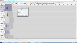
For this week our task was to create different assets. My job was to create some sound based 3D models (excluding texturing) and to master the sounds for our Student Union project,.

I created a variety of sounds such as effort sounds, footsteps, object collisions/crashes, ambience, objects scrapes, using the vending machine, TV remote, pool table and cash machine, and picking up a guitar.

I used a mix of recorded and found audio to chop and change different sounds in order to create a final product, I also changed the bass and treble in some cases, as well as sometimes adding reverb to make it sound like it's in a bigger room and add some echo.


I made other sounds, however they are currently not uploaded. I will hopefully have time to sort this out before the deadline.

I made an effort sounds for lifting an object, the same with reverb added, a natural walk cycle and more.

I also rigged up some music emitting from speakers in unity in order to practice 3D sound. You can view the scene by following this link.

https://googledrive.com/host/0Bzo0UfEzLxYea0F3V2VlbnNhWWs/TieIn.html

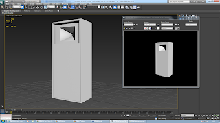
I also build a variety of models, such as 2 types of speaker (one that hangs and one that sits on the stage), a stage desk which was just a box, a microphone stand and the stairs for the stage.


Wednesday, 30 October 2013

Halloween


It's time for Halloween, which means it's time for something creepy or scary. Some form of monster, ghost or maybe something completely different.

I started off this task by doing some simple sketches. These were very quick, and strange.


I then decided to practice a certain paint over technique. I had a few things around the house to make a quick Halloween costume, so I decided to get an image of myself and get started.


I did this for a while and got the head and weapon done, however I got what I wanted out of it and decided that it wasn't really something to carry on with, I thought I could come up with something much more imaginative or fun.

I started thinking of certain types of ghosts, and one thing since we were given the brief that kept coming back to mind was the Pokemon Gengar, it is a ghost and I really like the design. I had a sketch of my own ghost idea, so I decided to create a creature with a likeness to Gengar, however with my own design aspects to it.


I create the model in Maya and sorted out the lighting and rendering, trying out a few different views.


First thing I did for the paint over was make a bright purple overlay, just for fun.


I then started working on the proper paint over, I used a much more dulled purple and did some work on the eyes, then added a flame and background. I tried many things with the eyes, such as overlay and luminosity layers to make them stand out, however I found nothing was working the way I wanted. I ended up putting a bright red dot in his eye matching it's shape, this was much more simple and I think more effective.


I then had some help with changing some of the colour and saturation of the image to get a it more contrast, to to help show off the ligthing a bit more. I then fiddle around with this to get my own result.


I think the lighting could have been better in this image to show of the face a bit more, however it was creepy how I wanted. The topology was rough in places, partly because I didn't know of the "Keep Faces Together" tick box in Maya at the time, wondering why all faces were extruding individually.

Thursday, 24 October 2013

SciFi Ship Last Week


Carrying on from what I did in the first week, I started to add some smaller details to the ship.

I added some cannons on the top and bottom of the ship, of course this is because it would have to be used in combat, the cannons would also be used for sending out energy waves to move objects and a variety of other things.


I added detail on the bottom of the ship, such as a bit more shape and separation for the small cargo hold, and the landing thrusters.


On the back I put on two more panels, to help the engine by spreading energy over the ship, part of the key to flying in space. I also exttruded in under where the wings fold up to represent the channels where energy flows along.


After having a model I was happy with I laid out the UVs and took a snapshot for texture creation in Photoshop.


For the textures I wanted to go for a warn and stylized look, organizing the colours how they were in the concept art and seeing if they worked.

I created some worn writing for the side of the ship.


I made the main parts of the ship the debris would pass look scratched or warn, at first I though this looked quite cool and nice. I added some texture overlay in places to give some parts more detail.


However as I went through the various texture sheets and as I started to add the same effect to everything else to keep it consistent, it got over the top. I added the writing I created for the ship into the texture, however this did not really match the rest of it.


I realize that if this ship was in a game in would be very inefficient, using 5 texture sheets for the one model, and that it would have been a better idea to lay out the UVs and paint the texture in a way that only uses one sheet, without too much hassle.


Some parts of the textures, such as the wings, I did not think were too bad, however once I got the textures on the ship I found they did not really work. There are other methods that would have worked better for creating them and given a more professional result, however I am glad I have this method a try, I have learnt that you need a lot more care and a set consistent style that workd for the world and object.


My model I was happy with, mostly, the topology around the wing got messy, with use of triangles I could have cleaned this up. However if I want them to be able to fold up in a game, they should have been separate combined objects.


I tried a few different renders, I tried to add green lights but had trouble with it.


Overall, aside from some topology and the textures. I am happy with the final product and what I learned from doing it. I was also happy with the concept behind it.


I later made a brighter render so that the textures and shape are easier to see.