Tuesday, 23 April 2013

Week 18 Sketches


For my observational this week I drew a toy of Yoshi I have from Mario Kart, I did this one pretty fast and feel it went well, the perspective is readable and you can tell how the shape of the toy works, some parts are a little off, but nothing that ruins it.


My creative I drew in the park, I decided to do a Pepsi max bottle as an astronaut  the design is simple and the perspective of the writing is off, but I enjoyed the idea and sketching it out.

Week 17 Sketches


My creative and observational drawing this week were on the same piece of paper. For my creative I did a quick mock of the Skeletal structure of the Pokemon "Muk", this went alright, it was something interesting to think about, however I think it bares more thought than a quick sketch, the structure I drew also wasn't overall practical, as it wasn't my design it was also more of a guessing game.

My observational is of some objects on a desk, to practive simple perspective and lighting again, increasing my understanding of how basic object work in perspective. However I don't think the perspective on the phone is quite right here.


Life Drawing Term 2


These are samples of what i've done, the rest of the collection is on disc.

I had a lot of fun in life drawing this term and learnt a lot of new techniques for drawing and trained my eye to see in more way, focusing on light, darks, negative space, the more obvious shapes, drawing solely in tone, weight balance, perspective and looking at the shape to figure out how best to represent it in different mediums such as pen, charcoal and ink. However the most interesting part I feel was when we drew with our off hands.

In our first lesson, we drew our hands following a pattern which represent movement or motion as you follow the images along.

 The drawing on left here was early life drawing for the second term, and was drawn from life. The drawing on the right was a self portrait, we all took pictures of ourselves to use as reference. I feel this went well, although unfinished it as all quite accurate and the shading was done well. The most interesting part for me is how my glasses distort my eyes, also the distortion of the camera.
 

This was a longer, pure tonal drawing. I feel the perspective and tone on this went well, it was very interesting looking at the tone and using that to find reference points, rather than lines. I think adding in some of the background scenery could have helped define the character.

 These were both different from what i've done before. The one on the left was with the charcoal on it's side, quickly putting in the overall shape and tone, and then using sharper lines afterwards to define it. On the right I covered the page in charcoal and used a rubber and sharper charcoal line to put in the shape. I like these styles and it would be interesting to see how they work in concept art. 
 

 This was a longer drawing, I did this with the paper on the floor and used ink to capture the main line and tone, I liked the style of this one, how the drops spread out into the page was interesting. It was good practice drawing on the floor for once as well.

 The drawing on the left is an ink drawing in which I used my left (off) hand for the character and my right hand for the scenery, I really liked the result of this one, I felt it was quite accurate and the squiggly left-handed lines gave it some life. The drawing on the right at the top of the picture were 10 minutes each with the left hand, the two at the bottom were quicker, I really like how the two at the top turned out, again the left-handed lines gave it a bit of life.
 

These are 2 of the favourite things I've done in life drawing, especially the pelvis on the right. Instead of using tones I used lines and changed their direction to capture the shape of the bone, it was part towards understanding how the shape of the pelvis worked, it ended up looking really nice and became a good reference for the pelvis shape. I did the ribs in a similar style, however I did draw them wrong, they are slightly to high or low on the left, though the process of doing the drawing did help train my eye, and teach me what can go wrong when drawing if you're not careful.

 These were all two minute drawings, all all did poses for each other. Some went better than others, the drawing on the left I drew with my left (off) hand, and the drawings on the right I drew with my right hand. I really enjoyed doing these, we were constantly making quick drawing judgements as we went though these, so we stayed focused and it was a great final thing to do to really train our eyes.
 

Mudbox

We have been having classes of mudbox, and in each of those have been learning different skills and performing task to learn the basics of how mudbox works.

The first thing I did was to do pretty much anything I wanted with a face, I ended up making a strange green alien, the only thing I didn't like was the mouth, the rest seemed to go well for my first attempt.


Our first mudbox task was to project an old man's image onto a face and sculpt it to add the depth of the wrinkles and skin. This didn't feel finished and the nose went badly, however there were some useful things I learnt from it, such as how to use an image as an effective reference.


 The next task, as part of learning the skeleton's anatomy, was to make a zombie-like skeleton, or a skeleton with a layer of skin. I really enjoyed doing this and learnt a lot in the process, and was very happy with the result. I had to sketch the pelvis a few times because it was hard to get my head around, and there are ways in which I think I can improve my work flow. Drawing everything on first helped me make things more accurate.


Similar to the Skeleton, we then had to sculpt the human muscles. I drew everything of first and then the sculpt itself was quite quick, the biggest challenge being differentiating between where thin layers of muscle overlapped, this I had to exaggerate. With more time I feel this could have been better, however my work flow was a lot smoother than with the last task.


Monday, 22 April 2013

Biped Basics


The purpose of this was to get familiar with Biped rigging and proportions, using provided animations to test and explore how these things work and are affected.

In learning Biped Basics I created a nose on one and use the bend and flex modifiers to give the nose a bit of bounce and motion as the character walks.

Here I created two bipeds of different size and shape and added a sit down animation, this showed how the bipeds with different proportions react to different animation movements. I also created a simple forward walk with a biped with shorter legs, this worked as I expected, the walk was fairly normal, as the footsteps were not too far space out, however obviously there are smaller strides in comparison to the size of the feet.

Here I rigged a provided skeleton to a biped, carefully making sure each part of the skeleton was correctly linked to each part of the biped. I then added an old man sitting down animation to suit the skeleton. I feel this went well and was not too difficult as it was all done with bones as individual objects.

I think I could take some of this further when the time come, the most challenging part is usually getting the biped into the right place. I did manage to see how different biped proportion were affected by animation, and it is mostly how you expect, though I think I could have experimented with the proportions a little more.

CAT Tutorials


Unless stated otherwise these different animations were created following a series of online tutorials, the aim of doing them was to learn the basics of how to use the Character Animation Tool-kit.

The first part of this was following the tutorial, in figure mode I created a CAT base human and fitted it to the provided mesh.

In class, not from on-line tutorial, we then altered the animation to make it look more natural and heroic. The walk looks good, however with some editing the mesh could look as though it was fitted much better.

Here I created a CAT from scratch and fitted it to a provided beast mesh. This was not too difficult and I feel it went well. In animation I remember there was not much wrong.

The purpose of this one was to use adjustment layers to make the head less bobby and to ground the feet so they weren't floating above the CAT, as well as a few other adjustments.

This tutorial took you through how to use Absolute layers. The red and blue on the character model represent 2 absolute layers each with different animations on them, this can be used to fine tune movement on a character, or to separate movement as seen here.

Here a ground plane and footsteps were used to make the character follow the pattern on the ground plan. The walk and run animations look un-natural, though I did achieve what I set out to do.

This was done in class, not from an on-line tutorial. We put 3 different CAT basics into a scene, I added walk animations to each and adjusted the way there were walking to make it look more natural. I then created a series of footsteps for each one. I created a line which I linked a dummy to, which I linked the CAT basic to. This created a walk animation following footsteps in a pattern. I then added a ground plan and made the footsteps follow it. I also added a teapot for when they do a strange dance at the end, this is something I could improve on, I found the key-frames and animation too limiting, and found it difficult to extend the time scale without instead having them dance at the end, or redoing most of it.

I feel I could have done some of these tutorials better, such as in places where the animation is odd or isn't smooth, however I am happy with it for a first attempt at using CAT, especially since I didn't spend long on each.

Pixel Art Evolution


To practice representing things in the isometric view, as well as altering the lighting to fit a scene. 

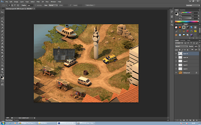
We started by importing models we wanted to use and placing them into perspective, below I use a hut.

I altered the light and shadow intensity in order for it to fit with the rest of the scene. it was challenge with this particular model as its base colour is dark, so changes in lighting were less noticeable and readable.

I used a plane to create the shadow under the hut, and adjusted the lighting to make it fit the rest of the scene. This plane was altered to not appear in the render.

In Photoshop, after rendering the object out as a Targa, we placed the object into the scene with the other objects created, and they fit well. The shadow has an opacity effect, rather than just being set for one part of the image.

In the final image I added a yellow Jeep, a dark hut, a well and a torch/flash-light. I feel the overall it went well, everything, including the hut, seems to be believable within the scene. The hut and well are in a different style, which I could improve on. The hut especially is quite odd within the scene, however that was intentional.

Girl Texture map deconstruction and animation


For this task we were provided with a figure that had already been pelt mapped, so our task was to skin the character for animation and completely re-texture them. I attempted to give a proper human face or to change the hair colour, however I had trouble finding a proper reference image to use, and the hair line did not look right with a colour change.


I recoloured and re-textured areas such as the trousers and jacket.


The animation is a simple sit down animation we were provided with. I took away the pony tail as it wouldn't fit with the texturing. The skinning for the animation seemed to go well, I managed to avoid stretches or any obvious abnormalities. We used a provided test animation to help see where any abnormalities are.


Anatomy: Muscles


This task, similar to the anatomy of the skeleton, was to gain an understanding of the shape of the main muscles in the body and how they worked, as well as what their function is.

I started out by doing sketches in my sketchbook of the body's main muscles. It was interesting to see exactly what they were connected to and what they were used for. I started to think of what movement would be like without a certain muscle and how it would affect the body performing different tasks. One of the most interesting for me was the Deltoid and thinking of how it works together with the arm's Ball & Socket joint.


Using the skeleton I drew before as I base, I began to create a reference for muscles. this captures the shape and placement of all the main ones, as well as how they fit in with all the other muscles I didn't study during the task.


I think I could improve by labelling in which direction muscles expand and contract (however I did draw lines in my sketches to suggest this). The side view of the skeleton was difficult to find a stock image for, and I feel the one I used was not as accurate or detailed as I would really have liked, sometimes this stock image and the other ones I had gathered did not completely match, however the main muscles were all captured and covered.

Fitting the Skeleton


For this our task was to sketch a skeleton over the top of an athlete running in a challenging perspective in order to think about how the bones would be placed in that situation, and how perspective works for both individual bones and the entire structure.


I think I could improve on some of the bones, such as the pelvis, ribs and spine placement/perspective, however overall the skeleton version of the athlete does give the same overall feel of motion and the perspective is similar.