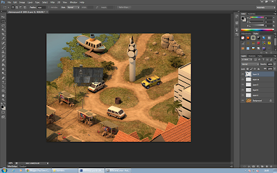
To practice representing things in the isometric view, as well as altering the lighting to fit a scene.
We started by importing models we wanted to use and placing them into perspective, below I use a hut.
I altered the light and shadow intensity in order for it to fit with the rest of the scene. it was challenge with this particular model as its base colour is dark, so changes in lighting were less noticeable and readable.
I used a plane to create the shadow under the hut, and adjusted the lighting to make it fit the rest of the scene. This plane was altered to not appear in the render.
In Photoshop, after rendering the object out as a Targa, we placed the object into the scene with the other objects created, and they fit well. The shadow has an opacity effect, rather than just being set for one part of the image.
In the final image I added a yellow Jeep, a dark hut, a well and a torch/flash-light. I feel the overall it went well, everything, including the hut, seems to be believable within the scene. The hut and well are in a different style, which I could improve on. The hut especially is quite odd within the scene, however that was intentional.


No comments:
Post a Comment